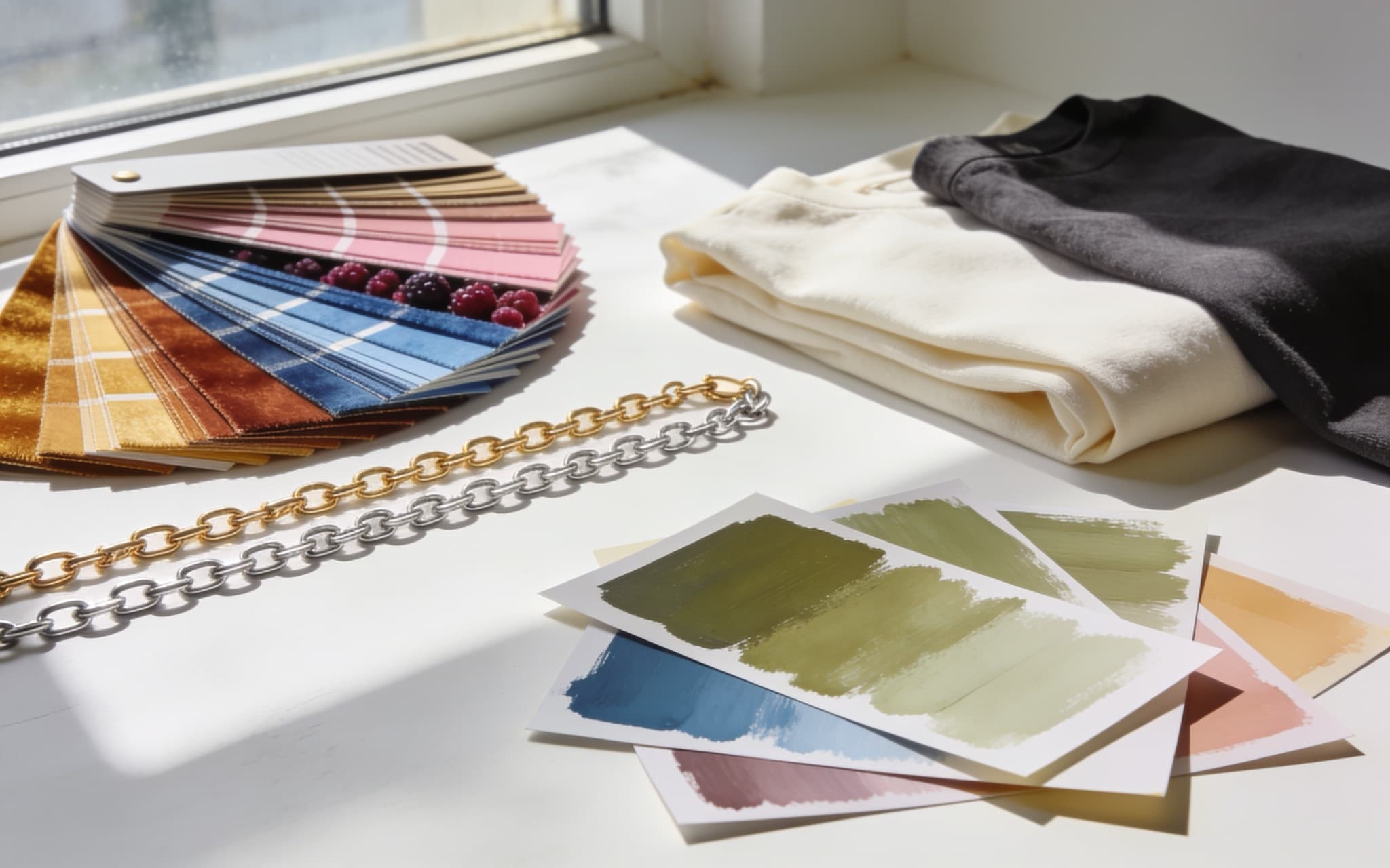
Undertone is the warm, cool, or neutral cast that sits under your skin's surface color, and it decides which colors make you look rested and which make you look tired. You find it by holding colors up to your face in daylight and watching what happens: gold against silver, pure white against cream, a warm red against a blue-based one. The colors that make your face look clearer win. Build a wardrobe palette from those and shopping gets shorter.
Two people can wear the same red. On one it looks expensive. On the other it looks like a bad night's sleep.
Undertone is not the same as how light or deep your skin is
Two people with the same depth of skin can suit different colors, and two people who look nothing alike can suit the same palette. Depth is how light or deep you are. Undertone is the cast underneath, and it runs across all of them.
That distinction matters because most color advice assumes light skin, then offers tests that only work there. If a test has never seemed to give you a clear answer, the test may be the problem.
Find it by looking, not by rules
No single test settles it. Run several in daylight, near a window, with your makeup off and your hair back, and look for agreement rather than a verdict.
Gold against silver. Hold a gold chain under your chin, then a silver one. One makes your face look brighter and the other makes it look slightly gray or flat. Gold flattering you points warm, silver points cool, and no clear difference points neutral. This is the most reliable of the quick tests, which is why the jewelry drawer is a better starting point than a chart.
Pure white against cream. Hold a bright white shirt to your face, then an ivory or cream one. One will look crisp against you and the other will look slightly off. Cool skin tends to take pure white cleanly; warm skin tends to look better in cream and can look drained beside stark white.
A warm red against a blue red. Tomato or brick on one side, cherry or raspberry on the other. Watch the skin under your eyes and around your mouth rather than the fabric. The better color makes shadows recede. The wrong one deepens them.
Your own wardrobe. The clothes that get you compliments are data. So are the ones that hang unworn despite fitting perfectly. Pull both piles out and look for a color pattern before you trust any test on this page.
A note on the vein test. You will see it everywhere: look at your inner wrist, green means warm and blue means cool. It is worth thirty seconds, but treat it as the weakest signal here. Vein color depends on how light scatters through skin, so it reads unclearly on deeper skin tones and on anyone whose wrists do not show much. If the vein test disagrees with the gold-and-silver test, believe the metals.
Line the results up. Three warm reads and one cool means warm. An even split means neutral, which is a real answer rather than a failure to find one.
Build the palette around it
Start with two or three neutrals that agree with your undertone. Warm skin leans on camel, cream, olive, and warm browns. Cool skin leans on gray, navy, charcoal, and pure white. These carry most of your outfits, so they are worth buying well.
Then add four or five colors that light you up. Warm undertones glow in rust, mustard, terracotta, coral, and forest. Cool undertones come alive in emerald, sapphire, berry, plum, and true red. Neutral skin gets to raid both lists.
Keep the palette small. A wardrobe built on a handful of colors mixes without effort, so you get more outfits from fewer pieces. It also survives the three tops, three bottoms, three shoes exercise, which collapses the moment your pieces disagree about color or proportion.
Where color meets shape
Undertone tells you which version of a color suits you. It says nothing about cut. A dress in your exact best green will still hang badly if the waist lands in the wrong place, and a perfect silhouette in a color that drains you reads as a near miss you cannot name.
The two answers are separate and you need both, which is why reading your proportions is the companion job to this one.
Use it, do not obey it
Undertone guidance is a shortcut, not a fence. If you love a color that sits outside your palette, pull it toward your face with the right neutral, or wear it on the bottom half where it does less to your complexion. Know why a color works and you can break the rule on purpose.
The same applies to trends. A season's color is worth trying and not worth forcing, which is how we think about trends.
Getting a second opinion on your own face
Judging color against your own face is hard. You are looking at the person you have seen most and are least able to see, in whatever light your bathroom happens to have, holding one fabric at a time.
Virtual Stylist reads your coloring from your photos and pulls real listings in the shades that suit you, so you see the color on you before you buy rather than after. We wrote about why we render on you instead of a model, and what happens to your photos.